Concrete is not just gray. When it comes to contrast and color, there are four main components to work with: cement, aggregates, pigments, and surface treatment. Many factors influence the final color, including the type of cement, the size and color of aggregates, water content, mixing techniques, finishing methods, pigments, and surface treatment.
While there are endless possibilities for working with color, it is important to keep things simple when designing with colored concrete. Concrete is a natural material, and its appearance can vary. One of the best practices in graphic concrete is to work with the natural color of the concrete itself.
Our friends at Graphic Concrete share practical options and clear guidance for using color in concrete, especially useful when architects are making early material decisions.
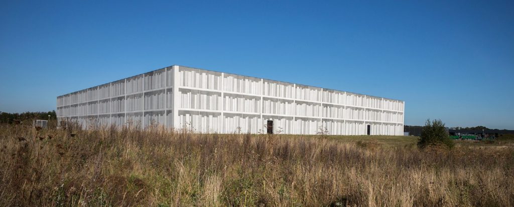
The Viborg Provincial Archive facade shows dots at varying distances up close, creating subtle different grey tones. From a distance, however, the facade resembles a three-dimensional bookcase.
Playing with texture and contrast
The contrast between exposed aggregate surfaces and smooth surfaces defines the graphic concrete pattern. The level of contrast can produce results ranging from dramatic and bold to elegant and subtle. Gray cement is commonly used, but slight color variations may appear on smooth surfaces. White cement delivers a more consistent color than gray cement.
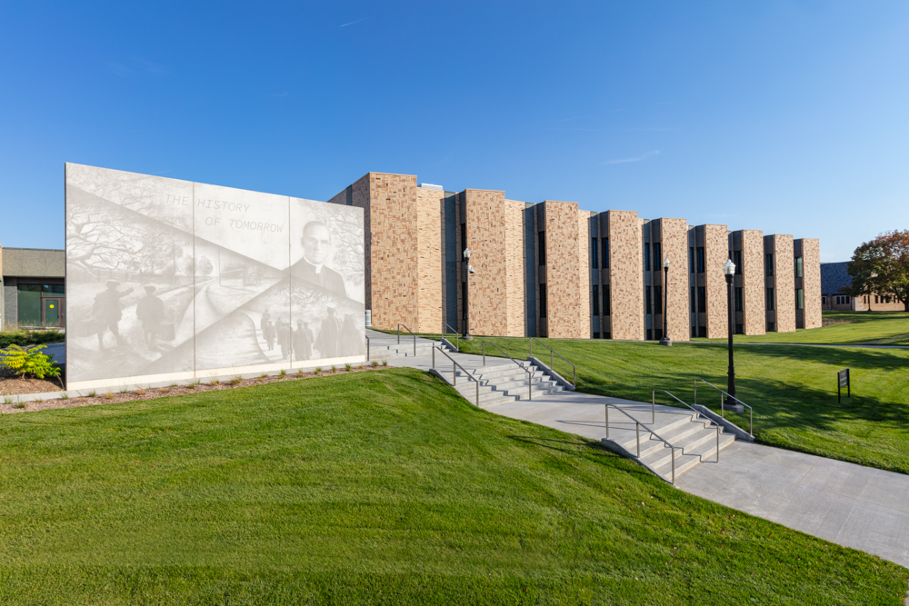
Using bigger contrast is for figurative graphics, for photos, images and art or for all types of 3D effects.

Using mild contrast is for elegant looks and subtle surface textures.

Concrete is a natural material, and its color varies in many ways. Even when using the same pattern, different combinations of cement, aggregates, and pigments create unique visual expressions. Achieving a perfectly unified color requires careful attention to all contributing variables.